Saturday, 10 November 2012

Sample 12&14...


Date
Thursday 1st November 2012
Fabric
Optic White Cotton
Dye type
Reactive Manutex Dyes
Colour Specifics
Yellow Mx8G and Turquoise MXG
What worked?
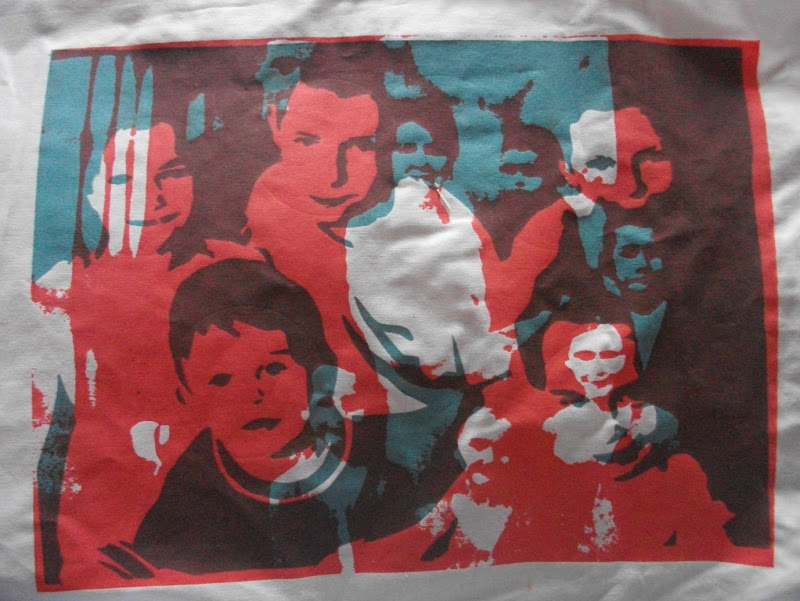
I did a variety of prints that were completed with 2 different coloured images of a person in my family. I used an older image of that person and a younger one, using the reactive dyes meant that both images would be seen but not in this case.
What went wrong and could be improved?
Because I put the lighter colour down first for the younger image and the darker turquoise over the top for the older image, the younger image is slightly difficult to see. The Yellow Mx8G is bright that it takes away from the detail, it blends into the fabric.
Notes
Change the Yellow mix to a darker shade. I began doing these prints as a way of showing an Alzheimer’s persons confusion in remembering recent faces, compared to remembering a face from the past which is more familiar to them.
Sample Number
Sample 12- Hannah


Date
Thursday 1st November 2012
Fabric
White Bleached Cotton
Dye type
Reactive Manutex Dye
Colour Specifics
Red MX8B and Yellow MX8G and Blue MXG mixed together to make a light, leaf green.
What worked?
My little brothers prints have always worked out well, I think it might be the positions he was photographed in. The younger and older image contrasted each other because the angles of his head went the opposite ways, I think this became I positive in the end, both faces can be seen clearly.
What went wrong and could be improved?
 
Notes
People say ‘Red and Green, Never to be seen’, but this colour combination works really well together, better than any other colour combination so far. 
Sample Number
Sample 14-My little brother James

Sample 10&11...


Date
Tuesday 30th October 2012
Fabric
White Bleached Cotton
Dye type
Reactive Manutex Dyes
Colour Specifics
Blue MXG  and Yellow Mx8G
What worked?
With using reactive dyes I predicted that the underneath image will come through the top layer image and it did. I chose to do the first print in the darker colour Blue MXG with the lighter colour of Yellow Mx8G over the top, the blue image came through and both images can be seen clearly. Once the colours are overlaid it created the colour of a luminous green.
What went wrong and could be improved?
Even though both images are seen clearly, I positioned the second image so that it would fit and be involved within the other image so there is a clear evident yellow line that blocks through some detail and makes it painfully that the images are 2 separate images rather than 2 images becoming one, like I wanted.
Notes
If I was to this again I would create a masking tape border that fits into the image.
Sample Number
Sample 10

Date
Tuesday 30th October 2012
Fabric
White Bleached Cotton
Dye type
Reactive Manutex Dye
Colour Specifics
Blue MXG and Scarlett MXG
What worked?
I prefer this print to the previous one because it looks how I wanted it to look, 2 images as 1 image. I also put the darker colour down first again as it worked for the sample previously. I think this experiment worked better than the other one because of the colour choice, red and blue and harmonious and work very well together.
What went wrong and could be improved?
 
Notes
 
Sample Number
Sample 11

Sample 8&9...


Date
Tuesday 30th October 2012
Fabric
White Bleached Cotton
Dye type
Reactive Dyes, mono-printing using Manutex with Foil print on top.
Colour Specifics
A mixture of reactive dyes hand painted onto my exposed screen using these particular colours: Orange Mx2R, Yellow MX-GR, Green MX 2B, Scarlet MXG and Blue MXG.
What worked?
As these were the failed Samples of 6 a&b I decided to use this as a background and work over the top to create the feeling of confusion and show the element of my family younger and older positioned next to each other. I used gold coloured foil.
What went wrong and could be improved?
Because of the stencil image I used and circled out, the detail on the faces were very limited, the gold foil did stand out because of the fact it was a reflective material. But because of the vibrant colours in the reactive dyes the foil got lost within the entire colour. 
Notes
I dislike this final piece because of this combination and how small the foil detail is.
Sample Number
Sample 8

Date
Tuesday 30th October 2012
Fabric
White Bleached Cotton
Dye type
Reactive Dyes, mono-printed using Manutex with flock printed over the top.
Colour Specifics
A mixture of reactive dyes hand painted onto my exposed screen using these particular colours: Orange Mx2R, Yellow MX-GR, Green MX 2B, Scarlet MXG and Blue MXG.
What worked?
Even though the techniques and images used were different, I expected to be disappointed like I was with the other sample, but my reaction was the opposite, I was really pleased with the results. I used Aubergine coloured flock which works well and stands out well with the other coloured image.
What went wrong and could be improved?
The techniques did surprisingly work well together, even though I did position the circles where I wanted, after looking at the finished sample now, the positioning could be better.
Notes
 
Sample Number
Sample 9

Sample 7...


Date
 
29th October 2012
Fabric
Optic Cotton
Dye type
Reactive Dyes, mono-printing using Manutex
Colour Specifics
A mixture of reactive dyes hand painted onto my exposed screen using these particular colours: Orange Mx2R, Yellow MX-GR, Green MX 2B, Scarlet MXG and Blue MXG.
What worked?
I did 2 prints of these designs and this is the 2nd print. I did 3 hard squeegee pulls straight across my screen covering all the unexposed areas. The colours used were wonderfully bright and bold. This 2nd print turned out surprisingly better than the first ones because it was much cleaner cut and stencil like.  
What went wrong and could be improved?
 
Notes
I like how the reactive dyes when wet blend into one another, so I used 5 specific colours and ended up with a range of shades in colour.
Sample Number
Sample 7 a&b

Sample 5...


Date
 
23rd October 2012
Fabric
Cotton Linen Slub
Dye type
Pigment Dye
Colour Specifics
2 drops of Scarlett YP and 2 drops of Blue RR but it were too dark so I added 2 more drops of Scarlett YP but then it turned the colour mix brown which I didn’t want, so then I added 2 drops of Red BB and a drop of white.
What worked?
I really like this print; I like the bold colour choice, the texture from the cotton slub as well as the print being perfectly detailed even with areas fading in adding extra detail and highlighting more areas and adding shadows making this print more realistic.
What went wrong and could be improved?
The area where my Dad was stood because of his suit a lot of that area is blocked out by colour, darkening the print a lot, this could be changed by altering the contrast.
Notes
 
Sample Number
Experiment 5

Thursday, 8 November 2012

Sample 3...


Date
 
23rd October 2012
Fabric
Bleach White Cotton
Dye type
Reactive Dye
Colour Specifics
Scarlet MXG reactive dyes, printed using Manutex.
What worked?
The colour definitely worked for me. I decided to use a reddish colour because I wanted to show my families faces bleeding into one another. I hand painted the dye on so I put extra colour around each body so there was added depth which worked out well.
What went wrong and could be improved?
Even though I am pleased with this print, I think this print could have been bolder, brighter and more powerful through its choice of colour. There is colour fading in certain areas which means this print has lost out on important detail in some of my families’ faces which is disappointing.
Notes
If I was to repeat this process again in the exact same way I would add extra dye to the faces to control and contain the smaller detail in the faces.
Sample Number
Experiment 3

Sample 2...


Date
 
23rd October 2012
Fabric
White Bleached Cotton
Dye type
Reactive Dye
Colour Specifics
Black MX Reactive Dyes  Manutex print
What worked?
Nothing worked! I wanted to experiment with blocking out certain areas of people’s faces to fit in with my project theme of Amnesia but too much was blocked out so nothing could be made out. Some interesting patterns have been created through using the hand painted print technique.
What went wrong and could be improved?
I used masking tape to block out certain areas so this material gave a straight cut edge, not blurry, which would be more fitting. If I were to try this again I would using smaller scale version of the masking tape to try to maintain a bit of the detail.
Notes
Experiment with a range of colours!
Sample Number
Experiment Number 2