Developing my project through samples was fairly simple, my ideas were constantly there to produce but whether the techniques and materials I chose were the right choice, I'm not convinced. Connections were made in my samples with the materials and the techniques, I tired out a variety of combinations looking for the right one and there never was, there was always room for improvement. My research in this half of the project didn't develop at all, I didn't remember or think of anything else that could inspire the theme of architecture. My chosen words of; Singular and Repetition was developed in my research through my primary photos as there was always elements of them words evident.
Selecting the idea of working with and over dyed fabrics was really a way of connecting my workshops together and making them work for me. Some of the dyeing samples with print techniques worked over them really worked, some however, didn't, I found this out just be experimenting and exploring with everything I've learn't.
I found this project of Sampling a great oppurtunity to explore and just go where the materials and techniques take me. My aim of this project was literally just to keep producing ideas and concepts into samples whether they would work or not. Looking at some of my samples they didn't work but they helped further my ideas.
During this project I realised the importance of Sampling and producing ideas without even thinking of the outcome sometimes. Sometimes the best results came from limited thinking about materials and techniques, it was about analysing the results afterwards and picking out what worked and exploring this.
I found working in the dye and print workshops very time consuming but worth it. I spent a lot of time producing samples which I think made my sketchbook lack on quality. My sketchbook could of definately done with more time in developing ideas through drawing and annotation.
Sunday, 19 February 2012
Friday, 17 February 2012


Printing on Suffolk Puffs


Dyed samples

For the sample above I really like the colour scheme I think it works really well, however the different shades of blue don't really fit in with my theme of architecture.

The background was created by dyeing it with elastic bands attached on areas, printing on the top of it with flock paper was successful but the background was too distracting.
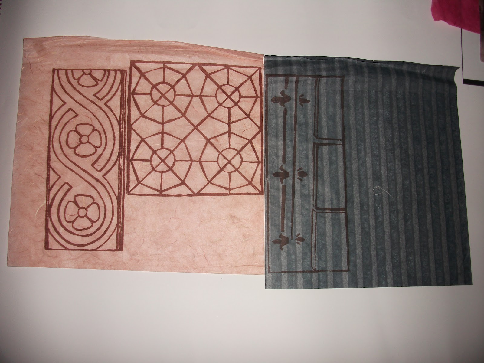
Samples


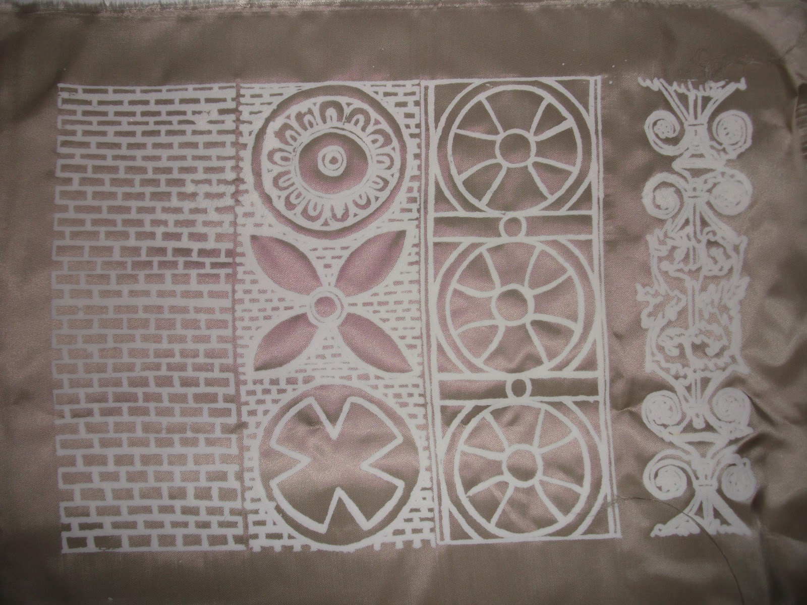
Stencil printing


Thursday, 16 February 2012
The drawing exercise!


My new design using Puff.

Foil printing with my new design.


Printing on top of dyed pieces of fabric.


Creating backgrounds to print on!


New technique


New techniques- Flock


New techniques


Even though we was asked by the tutor for in the first lesson to just do monoprinting mark makings to get used to using the manutex and ink, I decided I wanted at least one decent drawn't monoprint that had specific relevance to a building in my primary photos. After printing what I had drawn't I was pleasantly surprised with the results. I really like the boldness of the lines and because of how the manutex printed it created elements of light in areas, making this piece beautifully constructed.
My Personal Brief
Hayley Bartram- Personal Brief
My Visual Research will look at architecture and the individual detail in buildings that I find intriguing. This will be recorded through photography and drawing. Architecture will be the bases theme but the idea/concept may change as my project develops. My aim is to use a subtle colour palette and techniques that will range and vary from my previous workshops, whilst exploring new techniques that seem relevant. I may also decide to work towards creating garment pieces, as this would explore new possibilities. My intended project will still carry the same opposite words of Singular/Repetition.
Subscribe to:
Comments (Atom)